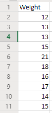
Box and whisker is another chart used in statistics to show distribution of data. Suppose you are a watermelon farmer. You weigh 10 watermelons and the weights are below. Unit of the weight is pound.
 2. You get a box and whisker chart now. The thin line at the bottom shows the minimum. The thin line on top shows the maximum. There is a blue box in the middle. Bottom of the blue box shows 25 percentile of the data. Top of the blue box shows 75 percentile of the data. There is an "X" mark in the middle of the blue box, which shows the median.

3. Suppose we have a super big watermelon which weighs 25 pounds. The data is below. If we make a box and whisker chart again, it displays an outlier because the 25 pound watermelon is way too heavier than other ones. Excel treats any value as an outlier if its value is too much away from other numbers.


1. Select the data. Then click Insert > Charts > Other Charts. Under Statistical, select Box and Whisker.
3. Suppose we have a super big watermelon which weighs 25 pounds. The data is below. If we make a box and whisker chart again, it displays an outlier because the 25 pound watermelon is way too heavier than other ones. Excel treats any value as an outlier if its value is too much away from other numbers.
Comments
Post a Comment